Digital flipbook software: pre-conversion asset checklist
You've exported what looked like a perfect PDF. The fonts tracked the way you wanted, the images were crisp, the hyperlinks tested cleanly.
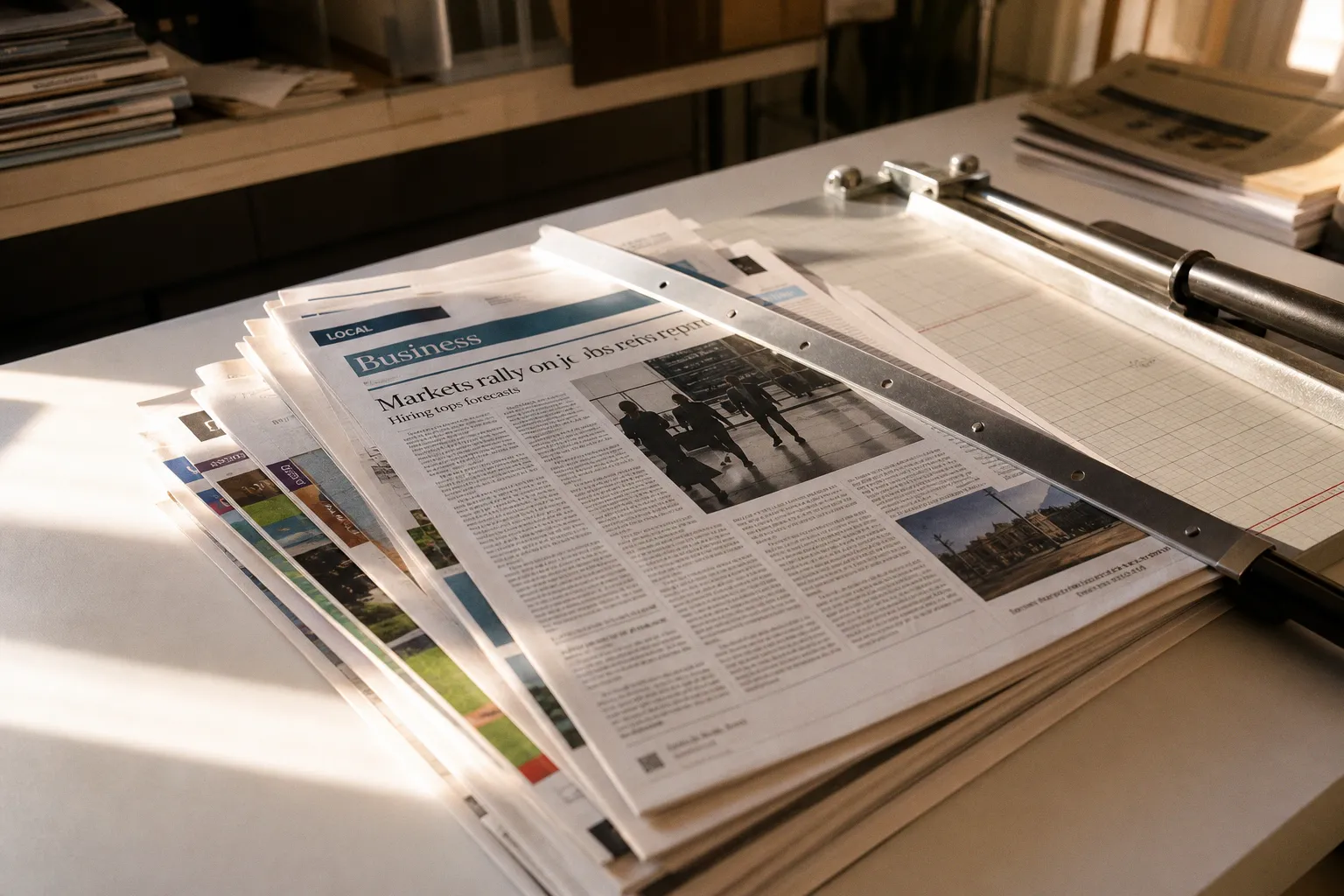
You drag the file into your flipbook platform, wait for the conversion to finish, and then the problems surface: a headline rendered in a substitute face because the typeface didn't travel with the file. A sponsor banner that lost its link somewhere in the pipeline. An infographic central to your story showing up as empty space to anyone using a screen reader. None of this is the platform failing you. It's the source file walking into the conversion missing a few critical things.
This is the part nobody warns you about when you sign up for a flipbook subscription. The marketing focuses on viewers, branded reading experiences, analytics dashboards — all the front-end polish. The unglamorous work of preparing the source PDF so it survives conversion intact is what determines whether the front-end polish actually has something solid to sit on. Here's how to handle that work before you upload, so your readers don't end up seeing the seams.
Get the source PDF into shape before conversion
Think of the flipbook platform as a translator. It can only render what you hand it. If the source file has unresolved issues — missing fonts, RGB images inside a CMYK workflow, transparent objects flattened incorrectly — they don't get cleaner in translation. They get messier, and usually silently.
The first habit worth building is a preflight pass on every export. Acrobat Preflight will inspect the PDF for the exact categories that cause conversion headaches: color spaces, fonts, transparency, image resolution, ink coverage, PDF version compatibility, syntax, and structure. It can also apply certain corrective fixups automatically, which saves a lot of manual cleanup. Run that profile before you upload, and you'll catch the kind of issues that would otherwise surface only after readers start complaining.
Image handling deserves its own pass. PDF export settings can control image compression and downsampling, and that dial is a direct trade between file size and visual quality. There's also lossless ZIP compression available for text and vector line art, which is worth turning on for content-heavy layouts — it keeps file weight down without degrading type or clean vector graphics. Newspapers and magazines usually carry a mix of high-resolution photography and crisp vector infographics, so a tiered approach (compressed raster, lossless vector) typically wins over a single global setting.
One ceiling to know about up front: InDesign's PDF export tops out at a page size of 200 × 200 inches (508 × 508 cm). Anything beyond that gets cropped, not scaled. It's a generous limit for almost any newspaper or magazine page, but if you're producing posters, broadsheet inserts, or oversized supplements, check your layout dimensions before you commit to a long export.
A clean source PDF is the cheapest insurance you'll ever buy against a broken flipbook.
Fonts, color, and the output intent question
Two decisions in the source file have outsized influence on what readers actually see: whether fonts travel with the PDF, and how color is described.
Embedding fonts is non-negotiable for flipbook delivery. When a typeface is embedded, the PDF carries the actual glyph data, so the viewer's device doesn't need the font installed to render the page correctly. Without embedding, the viewer falls back to a substitute — and the substitute is rarely an aesthetic match. Adobe's own documentation is blunt on this: embedding prevents font substitution, which is exactly the failure mode you're guarding against.
There's a catch the licensing side forces on you. Some fonts carry embedding restrictions in their permissions, and those restrictions can block embedding entirely. If you're using licensed typefaces from a foundry that restricts embedding, you have three practical options: move to a license that allows embedding, substitute a similar open-licensed face, or convert text to outlines before export. Converting to outlines locks the visual but kills searchability and accessibility, so use it as a last resort and only on text that absolutely cannot be re-flowed.
Color is the second big decision, and it depends on whether your flipbook is a print surrogate or a digital-native product. For anything that doubles as a print deliverable, the PDF/X family of standards is the conventional workflow. PDF/X-1a uses an output intent to describe the working CMYK space, and PDF/X-3 can carry an embedded ICC profile for color-managed conversion. If your flipbook is purely online with no press run attached, those standards are usually overkill, and an RGB-native workflow will look more vivid on screens without the round-trip through CMYK. The mismatch to avoid is exporting a print-ready PDF/X file and then expecting it to behave like an online-optimized flipbook. The compression, color, and file-size decisions are different, and forcing one workflow to do both jobs usually costs you quality somewhere.
Make accessibility a deliberate export step, not an afterthought
This is the area where the gap between "the PDF looks fine to me" and "the PDF works for everyone reading it" is widest. Accessibility in a flipbook is not automatic, even if your source document was authored carefully.
A tagged PDF — one that carries a structural tree — is the foundation. Tags describe reading order, headings, lists, and the role of each element on the page. Without them, a screen reader has no reliable way to walk a reader through your content. Acrobat Preflight and InDesign's export dialogs both offer tagged-PDF creation, but creating the tags is only the first step. You also need to verify the reading order. Complex layouts — multi-column articles, sidebars that wrap around images, footnotes, form fields, tables that span columns — are exactly the cases where the W3C warns that reading order can come out wrong after export, and where you'll likely need to repair it by hand.
Image alternatives are the next layer. Meaningful images should carry text alternatives through an /Alt entry in the tag tree. If an image contains words that are essential to understanding — a chart label, a quote rendered as a graphic, a headline on a poster image — that text belongs in the alt description, not just in a caption nearby. Decorative images can be marked as artifacts so they're skipped entirely by assistive tech; that distinction keeps the reading experience cleaner for screen-reader users without bloating the alt-text inventory.
Language metadata is small and easy to forget. Setting the document language in the PDF properties lets screen readers pick the right pronunciation library. For a publication that runs in multiple languages, this matters more than it sounds — a Spanish article announced with an English voice profile is jarring in a way that pulls readers out of the content.
Accessibility isn't a checkbox at the end of the export. It's a structural decision you make before you click "Export PDF."
Upload limits are platform-specific, and that's the whole point
One of the more common frustrations people hit before they even start thinking about quality: the upload fails. The file is too large, or too long, or contains too many separate files. There is no universal maximum PDF size, page count, supported PDF version, or supported interactive-feature set across flipbook platforms. Each provider sets its own plan-based limits, and those limits shift as the plans themselves change.
A concrete example from Flipsnack's August 2025 help documentation: the Starter plan allows 100 pages and 100 MB per flipbook; Professional moves to 200 pages and 500 MB; Business to 500 pages and 500 MB; Enterprise or Custom plans reach up to 3,000 pages and 500 MB. Flipsnack also caps the number of files that can be uploaded into a single flipbook at 100. None of those numbers are industry standards — they're one platform's tier structure as published in Flipsnack's August 2025 help documentation, and the limits may have shifted since. Before you commit to a plan, pull up the help docs for the platform you're actually using and check what its current limits are.
That variability has practical consequences for newspaper and magazine workflows. A weekly print edition with 80–120 pages, a Sunday supplement that doubles the count, and a quarterly special issue can each land in a different plan tier. If you're planning to publish multiple titles on the same account, sizing the plan against your largest expected issue is usually cheaper than upgrading mid-year. If you're uploading facing-page spreads rather than single pages, the page-count math halves — but that decision has downstream effects on hyperlinks, which we'll get to next.
Validate interactive elements after the viewer renders
Export settings in InDesign can preserve bookmarks, hyperlinks, cross-references, buttons, media, and page transitions when you export an interactive PDF. The standard PDF export dialog also surfaces tagged-PDF creation, bookmarks, hyperlinks, compression, color conversion, and security settings. That's a useful checklist in itself: each of those items is something the source file can either preserve or quietly drop, depending on what you check.
The bigger issue is what survives the flipbook conversion. No flipbook viewer guarantees preservation of every interactive element from the source PDF — bookmarks, layers, form fields, video, audio, JavaScript, page transitions, accessibility tags, and external hyperlinks are all candidates for partial or total loss after conversion. Translation: you can't assume the viewer on the other side keeps everything the source PDF had. Treat the published flipbook as a verification target, not a delivery endpoint. Open the viewer on the same devices your readers will use — phone, tablet, laptop — and walk the document end to end. Click every link. Play every embedded video. Tab through the document with a keyboard to confirm focus order matches reading order. Run a screen reader through at least one article.
One specific gotcha worth flagging: Flipsnack notes that links should already be properly hyperlinked in the source document before upload, and that missing imported links can sometimes be resolved by exporting the source PDF as single pages rather than spreads. So if your hyperlinks aren't arriving in the viewer, the layout choice in the source file may be the reason. That's the kind of small detail that's easy to miss until a sponsor asks why their banner isn't clickable.
| Verification target | What to check | Where to check it |
|---|---|---|
| Fonts | Headlines and body text match the design — no substitutes | Viewer on phone, tablet, and desktop |
| Links | Every hyperlink resolves; banner ads are clickable | Each link in the source PDF, then again in the viewer |
| Alt text | Meaningful images have /Alt entries; decorative images are tagged as artifacts | Acrobat Tag Tree panel |
| Reading order | Tab order matches logical reading order | Keyboard tab walk-through plus a screen-reader pass |
| Interactive media | Video and audio play; page transitions fire | Each device class your audience uses |
The pre-conversion checklist that actually saves time
Pulling this together into something you can run through on every issue:
1. Run Acrobat Preflight against color, fonts, transparency, image resolution, ink coverage, and PDF version. Apply fixups where they make sense.
2. Decide your color workflow up front: PDF/X-1a or PDF/X-3 if there's a print deliverable attached; RGB-native if the flipbook is digital-only.
3. Embed every font, and check the licensing first. Convert to outlines only as a last resort.
4. Set the document language in PDF properties, especially for multilingual editions.
5. Build the tag tree deliberately: headings, lists, alt text for meaningful images, artifact tagging for decoration.
6. Repair reading order on any layout that combines columns, sidebars, footnotes, tables, or form fields — those are the patterns that break first.
7. Check your current platform's plan limits on pages, file size, and files-per-flipbook before export.
8. Export from InDesign with interactive elements preserved, and verify each one in the viewer before publishing.
9. Walk the published flipbook on the devices your readers actually use, with a screen-reader pass and a keyboard tab walk.
10. If hyperlinks vanish, try re-exporting the source PDF as single pages instead of spreads.
What to prioritize if you can't do everything
If you're a small editorial team with limited prepress time, the order of operations that gives you the most return for the least effort is roughly: embed fonts (one setting, prevents the most visible failure), verify reading order on complex pages (catches accessibility regressions before they ship), and run a single-device viewer check (catches most interactive breakage). Print-color fidelity and full multi-device testing come next, then alt-text auditing across the entire archive.
For larger publishers running weekly editions, the work shifts toward automation: preflight profiles saved as Acrobat droplets, InDesign export presets that embed the right fonts and tagging settings by default, and a documented verification routine that runs against every issue before it goes live. The platforms will keep changing their plan limits and feature sets — that's their job — but the underlying source-file discipline is yours, and it's the one part of the pipeline that's fully under your control.
The flipbook viewer is the storefront. The PDF is the building. Spend the prep time on the building, and the storefront has something solid to show off.